Home>Technology and Computers>How To Add Axis Titles In Excel
Technology and Computers
How To Add Axis Titles In Excel
Published: February 28, 2024
Learn how to add axis titles in Excel to enhance your charts and graphs. Improve your data visualization skills with this simple technology and computers tutorial.
(Many of the links in this article redirect to a specific reviewed product. Your purchase of these products through affiliate links helps to generate commission for Noodls.com, at no extra cost. Learn more)
Table of Contents
Introduction
Adding axis titles to your Excel charts can significantly enhance the clarity and understanding of your data visualizations. Axis titles provide crucial context, helping viewers interpret the chart's information with ease. Whether you are creating a bar graph, line chart, or scatter plot, incorporating axis titles is a simple yet impactful way to communicate the significance of your data.
In this guide, we will walk through the step-by-step process of adding axis titles in Excel. By following these instructions, you will be able to effectively label the x-axis and y-axis of your charts, ensuring that your audience can quickly grasp the meaning and implications of the displayed data.
Excel's charting capabilities are powerful tools for presenting data in a visually compelling manner. However, without clear axis titles, the insights and trends within the charts may not be immediately apparent to the viewer. Therefore, understanding how to add axis titles is an essential skill for anyone who wants to create professional and informative charts using Excel.
By the end of this tutorial, you will have the knowledge and confidence to seamlessly integrate axis titles into your Excel charts, enabling you to convey your data's key takeaways with precision and clarity. Let's dive into the step-by-step process of enhancing your charts with informative axis titles.
Read more: How To Add Secondary Axis In Excel
Step 1: Open your Excel spreadsheet
To begin the process of adding axis titles to your Excel charts, you'll need to open the Excel spreadsheet containing the chart you want to enhance. Launch Microsoft Excel on your computer and locate the spreadsheet file that contains the chart you wish to work with. If you don't have an existing spreadsheet, you can create a new one by selecting "New" from the Excel home screen and choosing a blank workbook.
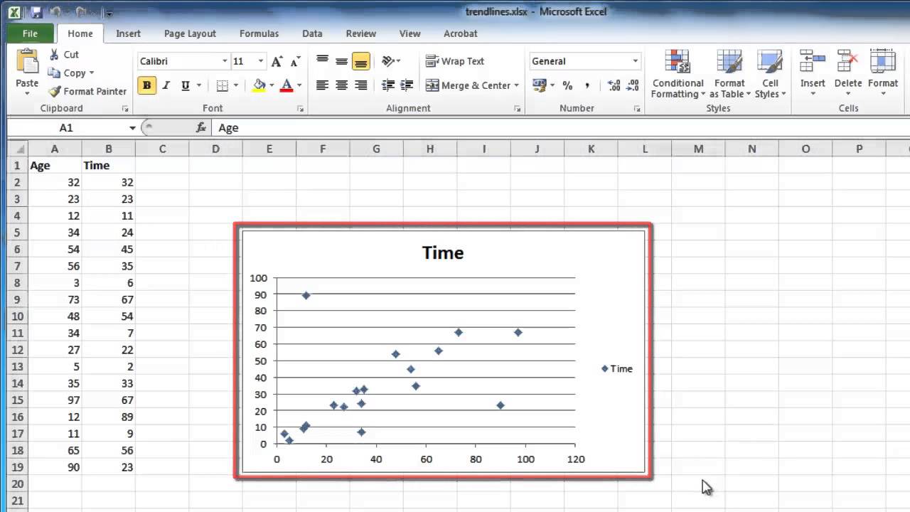
Once you have the spreadsheet open, navigate to the worksheet that contains the chart. If the chart is not already created, you can generate a new one by selecting the data you want to visualize and then clicking on the "Insert" tab in the Excel ribbon. From there, choose the type of chart you want to create, such as a bar chart, line chart, or pie chart.
After the chart is displayed on the worksheet, you are ready to proceed with adding axis titles. It's important to ensure that the chart is clear and easily accessible within the spreadsheet, as this will facilitate the process of adding the axis titles in the subsequent steps.
By opening your Excel spreadsheet and locating the chart you want to work with, you have completed the first step towards enhancing your data visualization. With the spreadsheet open and the chart in view, you are now prepared to move on to the next step of adding axis titles to your Excel chart.
Step 2: Select the chart you want to add axis titles to
Once you have your Excel spreadsheet open and the chart you wish to enhance with axis titles visible, the next step is to select the specific chart to which you want to add axis titles. This process is essential for ensuring that the axis titles are accurately applied to the intended chart within your Excel workbook.
To select the chart, simply click on the chart area. This action will activate the chart and allow you to make modifications to its elements. If your spreadsheet contains multiple charts, ensure that you choose the correct one by clicking directly on the chart you want to work with.
When selecting the chart, it's important to pay attention to the visual cues provided by Excel. The selected chart will typically be surrounded by a border or highlighted in some way, indicating that it is the active element within the worksheet. This visual feedback confirms that you have successfully chosen the chart for the next steps of the axis title addition process.
Additionally, by selecting the chart, you are preparing to engage with the chart elements and make targeted adjustments to improve its clarity and communicative power. This deliberate selection sets the stage for the subsequent actions that will lead to the seamless integration of axis titles into your Excel chart.
By ensuring that the correct chart is selected, you are laying the groundwork for a precise and effective application of axis titles. This step sets the stage for the upcoming actions, allowing you to focus on the specific chart that will benefit from the addition of clear and informative axis titles.
With the chart selected, you are now ready to proceed to the next step, which involves accessing the necessary tools within Excel to add axis titles to the chosen chart. This deliberate selection ensures that your efforts are directed towards the precise enhancement of the intended chart, setting the stage for a successful integration of axis titles in the subsequent steps.
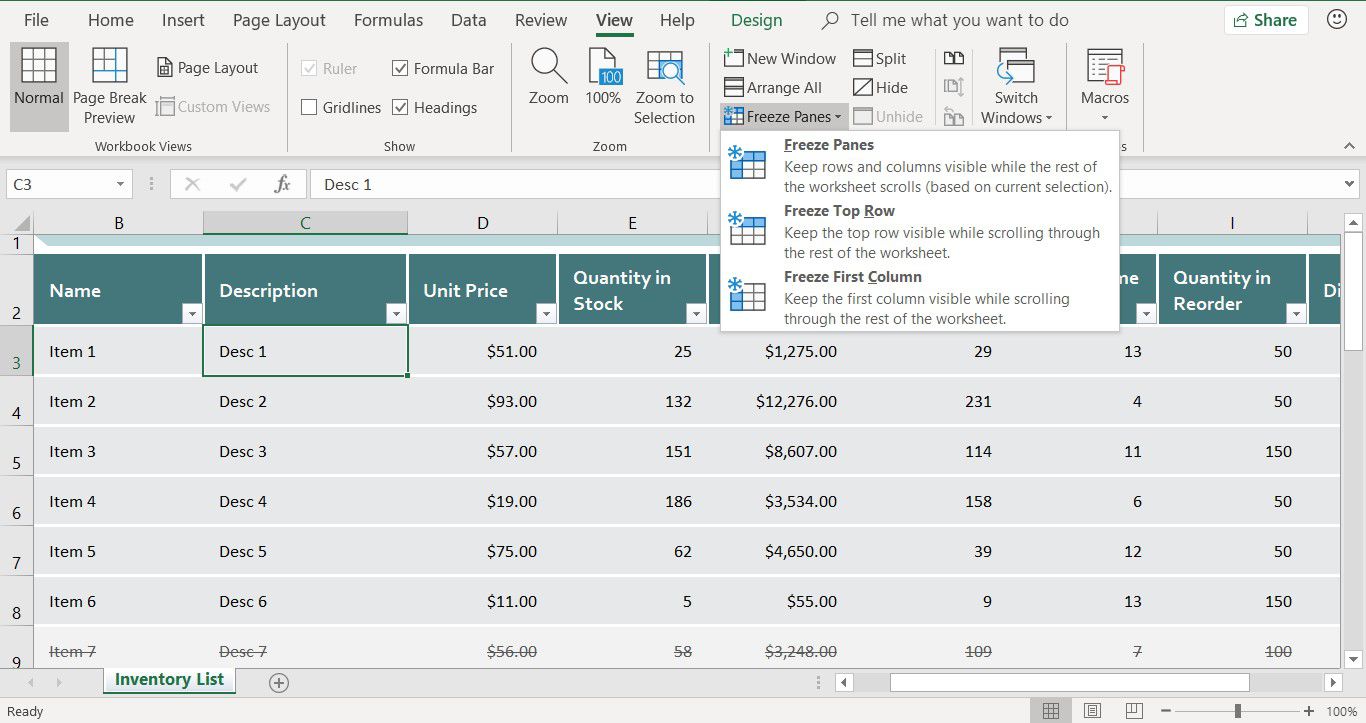
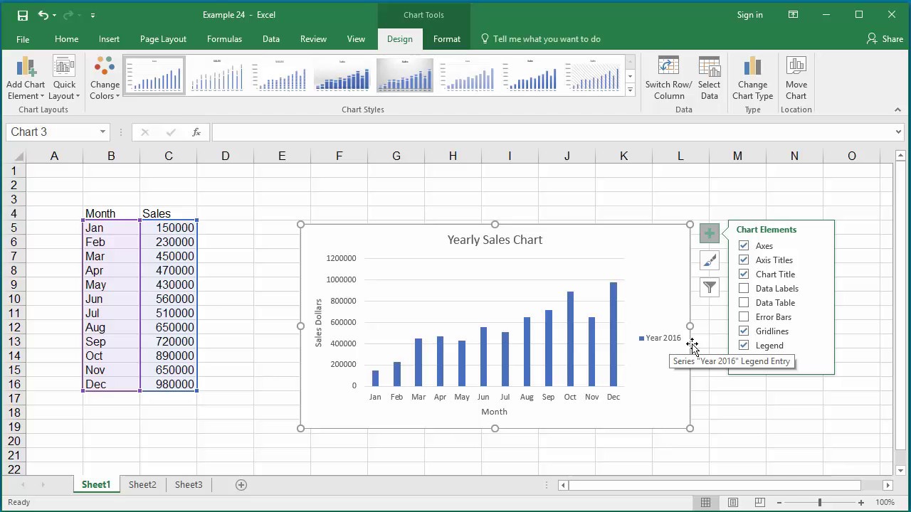
Step 3: Click on "Chart Elements" button
After selecting the chart you want to enhance with axis titles, the next crucial step is to access the "Chart Elements" button within Excel. This button serves as the gateway to a range of chart customization options, including the ability to add axis titles. By clicking on "Chart Elements," you will gain access to a menu that allows you to modify various components of the chart, empowering you to refine its visual presentation and enhance its communicative impact.
To locate the "Chart Elements" button, ensure that the selected chart remains active within the Excel worksheet. Look for the "Chart Tools" contextual tab in the Excel ribbon, which appears when a chart is selected. Within the "Chart Tools" tab, you will find the "Design" and "Format" tabs, each containing a wealth of chart customization options. Click on the "Design" tab to reveal a set of commands tailored to chart modification, including the "Add Chart Element" button.
Upon clicking the "Add Chart Element" button, a dropdown menu will appear, presenting a comprehensive list of elements that can be added to the chart. Among these options, you will find "Axis Titles," which is the key feature we are aiming to incorporate into the chart. By selecting "Axis Titles" from the dropdown menu, you will prompt Excel to display additional choices, allowing you to specify whether you want to add a title to the primary horizontal axis (bottom) or the primary vertical axis (left).
By clicking on the specific axis title option you wish to add, Excel will seamlessly integrate the chosen axis title into the chart, thereby enhancing its clarity and informational value. This intuitive process empowers you to effortlessly customize the chart to suit your data visualization needs, ensuring that the axis titles are precisely positioned and clearly labeled for optimal comprehension.
In summary, clicking on the "Chart Elements" button and navigating to the "Axis Titles" option within Excel's chart customization menu is a pivotal step in the process of adding axis titles to your charts. This action unlocks the potential to refine and enrich your charts, enabling you to imbue them with clear and informative axis titles that enhance the overall impact of your data visualizations.
Step 4: Check the "Axis Titles" box
Once you have accessed the "Chart Elements" menu and selected the specific axis title you want to add, the next essential step is to check the "Axis Titles" box. This action serves as the definitive command to instruct Excel to incorporate the chosen axis title into the selected chart, thereby enhancing its clarity and communicative power.
After selecting the "Axis Titles" option from the "Chart Elements" menu, Excel will present a list of additional customization choices, including the specific axis titles available for incorporation. At this stage, you will notice checkboxes corresponding to the primary horizontal axis (bottom) and the primary vertical axis (left). By checking the appropriate box, you are signaling to Excel that you want to add an axis title to the corresponding axis within the chart.
When checking the "Axis Titles" box, it's important to ensure that you are selecting the correct axis for the addition of the title. This deliberate action allows you to precisely designate where the axis title will be positioned within the chart, aligning it with the relevant data and enhancing the viewer's understanding of the visualized information.
By checking the "Axis Titles" box, you are actively shaping the visual presentation of the chart, imbuing it with informative labels that provide crucial context for interpreting the displayed data. This deliberate customization elevates the chart from a mere visual representation to a clear and insightful communication tool, empowering viewers to grasp the significance of the data with ease.
In summary, checking the "Axis Titles" box within Excel's chart customization menu is a pivotal step in the process of adding axis titles to your charts. This action enables you to precisely specify the axes to which the titles will be added, ensuring that your charts are equipped with clear and informative axis titles that enhance their overall impact and communicative effectiveness.
Read more: How To Add A Line In Excel
Step 5: Choose the axis title you want to add
After checking the "Axis Titles" box for the specific axis within the "Chart Elements" menu, the next crucial step is to choose the axis title you want to add to the selected chart in Excel. This step allows you to tailor the axis title to best complement the data being visualized, ensuring that it provides clear and relevant information to the viewer.
Upon checking the "Axis Titles" box, Excel will prompt you to select the specific axis title you wish to add. You will typically be presented with options such as "Primary Horizontal Axis Title" and "Primary Vertical Axis Title." By choosing the appropriate axis title, you are directing Excel to incorporate a descriptive label that aligns with the data represented along the corresponding axis.
When choosing the axis title, it's important to consider the nature of the data being presented in the chart. For the horizontal axis, which often represents categories or time periods, the axis title should succinctly convey what is being measured or displayed. This could include labels such as "Time (Years)" or "Product Categories," providing essential context for interpreting the chart's horizontal data points.
Similarly, when selecting the axis title for the vertical axis, which typically represents numerical values, it's crucial to choose a title that clearly indicates the unit of measurement or the specific data being depicted. This could involve titles such as "Revenue (USD)" or "Quantity (Units)," offering viewers a clear understanding of the vertical data scale and facilitating accurate interpretation of the chart's vertical data points.
By choosing the axis title that best aligns with the nature of the data and the chart's purpose, you are ensuring that the added label enhances the chart's clarity and informational value. This deliberate selection process empowers you to customize the axis titles to suit the specific context of the data visualization, enabling viewers to quickly grasp the significance of the displayed information.
In summary, choosing the axis title you want to add is a pivotal step in the process of enhancing your Excel charts with clear and informative labels. By carefully selecting the axis titles for both the horizontal and vertical axes, you are enriching your charts with descriptive labels that provide essential context and facilitate a deeper understanding of the visualized data.
Step 6: Edit the axis title text
Once you have added the axis titles to your Excel chart, the next crucial step is to edit the axis title text to ensure that it conveys the intended information clearly and effectively. Excel provides intuitive tools for customizing the appearance and content of axis titles, allowing you to refine the text to best complement the chart's data and enhance its communicative impact.
To edit the axis title text, begin by selecting the axis title you want to modify. This can be done by clicking directly on the axis title within the chart, which will activate the text for editing. Once the axis title is selected, you can proceed to customize the text according to your specific requirements.
Excel offers a range of options for editing axis title text, empowering you to tailor the content, font, size, color, and alignment to best suit your visualization needs. By right-clicking on the selected axis title, you can access a context menu that provides various formatting options, including the ability to change the font style, adjust the font size, apply bold or italic formatting, and modify the text color.
Furthermore, Excel's ribbon interface offers a dedicated "Format" tab when the axis title is selected, providing a comprehensive array of text formatting tools. From this tab, you can refine the appearance of the axis title by adjusting the font attributes, aligning the text within the chart, and applying additional formatting enhancements to ensure optimal visibility and clarity.
When editing the axis title text, it's essential to consider the readability and visual coherence of the chart. By choosing a font style and size that aligns with the overall aesthetic of the chart and ensuring that the text color contrasts effectively with the chart background, you can enhance the axis titles' visibility and ensure that they stand out as clear and informative labels within the visualization.
By customizing the axis title text to best complement the chart's content and visual presentation, you are refining the chart's communicative power and ensuring that viewers can readily interpret the displayed data. This deliberate editing process empowers you to fine-tune the axis titles, transforming them into impactful elements that contribute to the overall clarity and effectiveness of your Excel chart.
Step 7: Repeat for the other axis
After successfully adding and customizing the axis title for one axis, it's essential to repeat the process for the other axis to ensure comprehensive clarity and context within your Excel chart. By addressing both the horizontal and vertical axes with informative titles, you can provide viewers with a complete understanding of the data being visualized.
To begin, select the axis for which you want to add a title. This can be done by clicking directly on the axis within the chart, activating it for further customization. Once the axis is selected, proceed to access the "Chart Elements" button and navigate to the "Axis Titles" option, mirroring the process followed for the first axis.
Upon selecting the "Axis Titles" option, Excel will present the available choices for adding titles to the chart's axes. By checking the appropriate box and choosing the specific axis title, you can seamlessly integrate the second axis title into the chart, aligning it with the corresponding data and enhancing the viewer's comprehension of the visualized information.
Just as with the first axis, it's crucial to carefully consider the nature of the data represented along the second axis when choosing the axis title. By selecting a title that succinctly conveys the meaning and context of the data, you can ensure that viewers can readily interpret the chart's content and derive meaningful insights from the visualized information.
Once the axis title is added, proceed to edit the text to align with the overall aesthetic and communicative goals of the chart. Excel's formatting tools provide the flexibility to customize the appearance and content of the axis title, allowing you to refine the text to best complement the chart's data and enhance its overall impact.
By repeating the process for the other axis, you are ensuring that your Excel chart is equipped with clear and informative axis titles that provide essential context for interpreting the displayed data. This comprehensive approach enhances the chart's communicative effectiveness, empowering viewers to grasp the significance of the visualized information with ease.
In summary, by adding and customizing axis titles for both the horizontal and vertical axes, you are enriching your Excel chart with descriptive labels that contribute to its overall clarity and informational value. This deliberate and comprehensive approach ensures that your chart effectively communicates the underlying data, empowering viewers to engage with and understand the visualized information.
Conclusion
In conclusion, the process of adding axis titles to your Excel charts is a straightforward yet impactful method for enhancing the clarity and communicative power of your data visualizations. By following the step-by-step guide outlined in this tutorial, you have gained the knowledge and confidence to seamlessly integrate axis titles into your charts, ensuring that your audience can readily interpret and derive meaningful insights from the displayed data.
The addition of axis titles serves as a crucial element in transforming your Excel charts from mere visual representations to clear and insightful communication tools. By providing essential context for interpreting the data along the horizontal and vertical axes, axis titles empower viewers to grasp the significance of the visualized information with ease. This, in turn, enhances the overall effectiveness of your data presentations, enabling you to convey key insights and trends with precision and clarity.
Through the deliberate selection and customization of axis titles, you have the ability to tailor the labels to best complement the specific context of the data visualization. Whether it involves conveying time periods, product categories, numerical values, or any other relevant data, the axis titles you add play a pivotal role in guiding viewers through the chart's information, facilitating a deeper understanding of the underlying data.
Furthermore, the process of editing the axis title text allows you to refine the appearance and content of the labels, ensuring optimal visibility and coherence within the chart. By customizing the font style, size, color, and alignment, you can enhance the axis titles' visual impact, making them clear and informative elements that contribute to the overall communicative effectiveness of your Excel charts.
By addressing both the horizontal and vertical axes with informative titles, you have equipped your Excel charts with comprehensive context, enabling viewers to interpret the data with confidence and derive meaningful insights. This deliberate and comprehensive approach ensures that your charts effectively communicate the underlying data, empowering viewers to engage with and understand the visualized information.
Incorporating axis titles into your Excel charts is not only a practical skill but also a valuable means of elevating the impact of your data presentations. By leveraging the insights gained from this tutorial, you are well-positioned to create professional and informative charts that effectively convey the significance of your data, making a compelling impact on your audience.