Home>Technology and Computers>How To Add Trendline In Excel
Technology and Computers
How To Add Trendline In Excel
Published: March 2, 2024
Learn how to easily add a trendline in Excel to analyze data trends and make informed decisions. Master the technology and computer skills needed for effective trend analysis.
(Many of the links in this article redirect to a specific reviewed product. Your purchase of these products through affiliate links helps to generate commission for Noodls.com, at no extra cost. Learn more)
Table of Contents
Introduction
Adding a trendline to an Excel chart can provide valuable insights into the underlying patterns and trends within your data. Whether you are analyzing sales figures, stock prices, or scientific measurements, trendlines offer a visual representation of the data's trajectory, making it easier to identify patterns and make informed decisions.
Trendlines are a powerful tool for anyone working with data in Excel. They can help you identify and understand trends, forecast future values, and make data-driven decisions. By adding a trendline to your chart, you can visually represent the general direction of the data and make predictions based on historical trends.
In this article, we will explore the process of adding a trendline to an Excel chart, including the different types of trendlines available and how to customize them to suit your specific analytical needs. Whether you are a seasoned Excel user or just starting to explore the world of data analysis, understanding how to add and manipulate trendlines can significantly enhance your ability to extract meaningful insights from your data.
By the end of this article, you will have a comprehensive understanding of how to leverage trendlines in Excel to gain deeper insights into your data and make more informed decisions based on historical trends. Let's dive into the world of trendlines and discover how they can elevate your data analysis capabilities within Excel.
Read more: How To Add A Line In Excel
Understanding Trendlines
Trendlines are a fundamental tool in data analysis, providing a visual representation of the general direction and trajectory of a dataset. When applied to an Excel chart, a trendline helps to identify and understand patterns, making it easier to interpret the data and make informed decisions.
In essence, a trendline is a straight or curved line that depicts the general direction of the data points on a chart. It serves as a valuable aid in identifying trends, patterns, and correlations within the data. By adding a trendline to a chart, you can gain insights into the underlying behavior of the data, such as whether it is exhibiting a steady increase or decrease, fluctuating within a specific range, or following a more complex pattern.
Trendlines are particularly useful for identifying and forecasting trends, making them an essential tool for businesses, analysts, and researchers. They enable users to make predictions based on historical data, providing valuable insights into potential future outcomes.
In Excel, trendlines can be applied to various types of charts, including line, scatter, column, and bar charts. This versatility allows users to analyze different types of data and visualize trends across various datasets.
It's important to note that while trendlines are powerful tools for identifying patterns and making predictions, they should be used with caution. Trendlines are based on historical data and assume that past trends will continue into the future. As such, they may not account for sudden changes or external factors that could impact the data's trajectory.
Understanding the limitations of trendlines is crucial for accurate data analysis and decision-making. It's essential to complement trendline analysis with a comprehensive understanding of the underlying data and the broader context in which it exists.
By grasping the concept of trendlines and their applications, Excel users can harness the power of visual representation to gain deeper insights into their data, identify trends, and make informed decisions based on historical patterns. With this understanding, users can leverage trendlines to enhance their data analysis capabilities and drive more informed decision-making processes.
Adding a Trendline in Excel
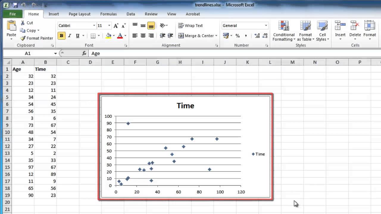
Adding a trendline to an Excel chart is a straightforward process that can significantly enhance the visual representation of your data. Whether you are working with sales figures, scientific measurements, or any other dataset, incorporating a trendline can provide valuable insights into the underlying trends and patterns.
To add a trendline in Excel, begin by creating a chart that visualizes your data. Once the chart is created, follow these simple steps to add a trendline:
-
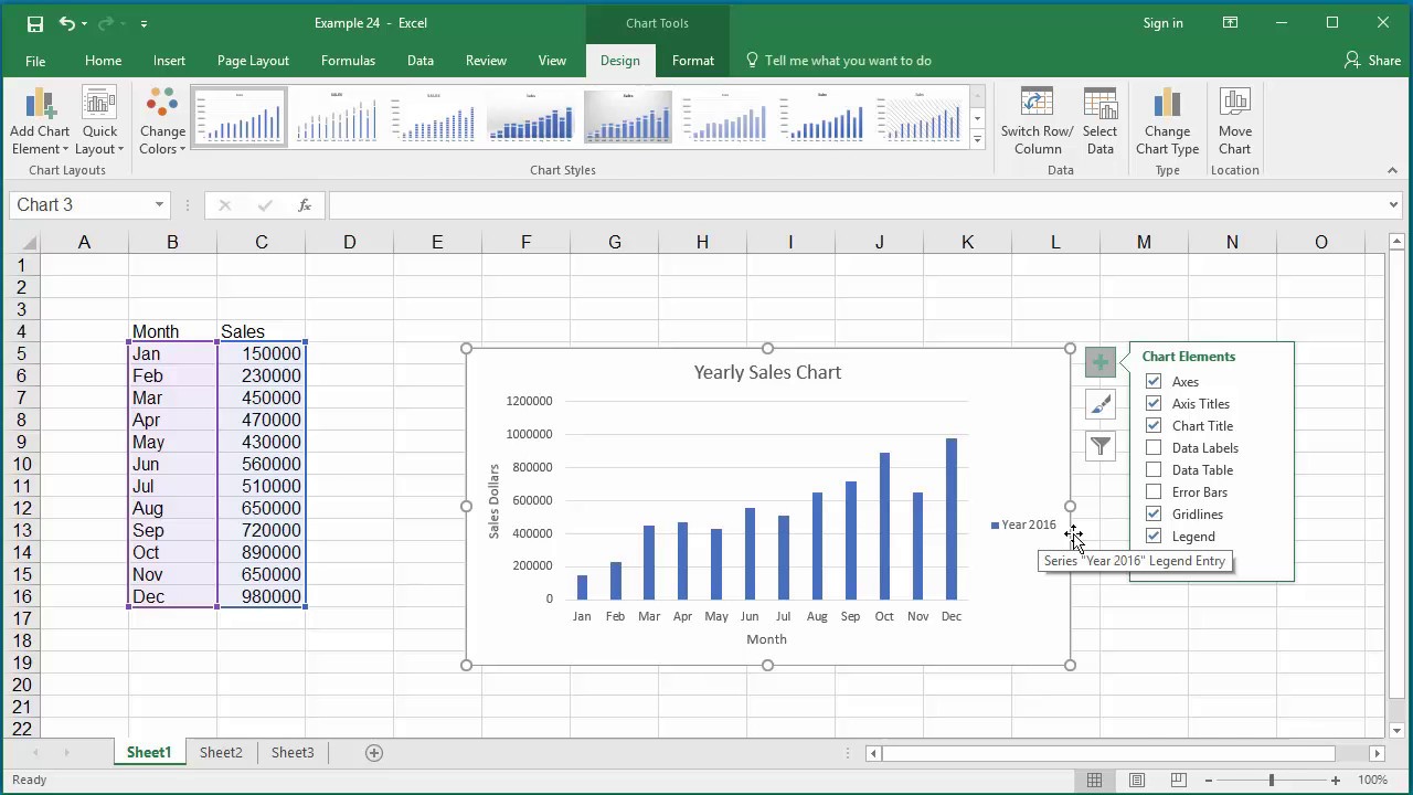
Select the Chart: Click on the chart to ensure it is active and selected.
-
Open the Chart Elements Menu: Navigate to the "Chart Elements" button, typically located near the upper-right corner of the chart. Clicking on this button will open a dropdown menu with various chart elements.
-
Add a Trendline: Within the "Chart Elements" menu, locate and select the "Trendline" checkbox. This action will add a default linear trendline to the chart.
-
Customize the Trendline: After adding the default trendline, you can further customize it to suit your specific analytical needs. Right-click on the trendline to access a range of customization options, including different trendline types, formatting, and additional trendline options.
By following these steps, you can seamlessly incorporate a trendline into your Excel chart, providing a visual representation of the data's trajectory and enabling you to identify and understand underlying trends and patterns.
Adding a trendline in Excel is a valuable skill for anyone working with data, as it allows for the visualization of trends and patterns within the dataset. Whether you are analyzing historical sales data to forecast future trends or examining scientific measurements to identify patterns, the ability to add and customize trendlines in Excel empowers users to gain deeper insights into their data and make informed decisions based on historical trends.
By mastering the process of adding trendlines in Excel, users can elevate their data analysis capabilities, enabling them to effectively communicate trends and patterns to stakeholders, make data-driven decisions, and forecast future outcomes with confidence. Excel's intuitive interface and robust charting capabilities make it easy for users to incorporate trendlines into their data visualization, providing a powerful tool for data analysis and decision-making.
Choosing the Right Trendline Type
When adding a trendline to an Excel chart, it's essential to consider the nature of your data and the specific insights you aim to derive. Excel offers various trendline types, each suited to different data patterns and analytical requirements. Understanding the available trendline types and selecting the most appropriate one is crucial for accurate data analysis and interpretation.
-
Linear Trendline: This type of trendline is suitable for data that exhibits a steady, linear progression. It is represented by a straight line and is commonly used to identify consistent growth or decline in the dataset. Linear trendlines are valuable for assessing the overall trend and making predictions based on a consistent rate of change.
-
Exponential Trendline: When dealing with data that demonstrates exponential growth or decay, an exponential trendline is the ideal choice. This trendline type is characterized by a curved line that indicates rapid growth or decline over time. It is commonly used in scenarios such as population growth, compound interest, or the spread of viral infections.
-
Logarithmic Trendline: Data that follows a logarithmic pattern, where the rate of change decreases over time, can be effectively represented using a logarithmic trendline. This trendline type is beneficial for analyzing data that initially experiences rapid changes but eventually stabilizes. It is commonly applied in fields such as biology, chemistry, and economics.
-
Power Trendline: A power trendline is suitable for data that exhibits a nonlinear pattern, where the rate of change increases or decreases at a consistent rate. This trendline type is represented by a curved line and is often used in scientific research, engineering, and physics to analyze complex relationships between variables.
-
Polynomial Trendline: When the data follows a polynomial pattern, a polynomial trendline can be applied to capture the varying degrees of change within the dataset. This trendline type is versatile and can accommodate a wide range of data patterns, making it suitable for analyzing diverse datasets with complex relationships between variables.
By carefully selecting the appropriate trendline type, Excel users can effectively capture the underlying patterns and trends within their data, enabling them to make informed decisions and predictions based on historical data. Understanding the characteristics of each trendline type and its suitability for different data patterns empowers users to leverage Excel's analytical capabilities to their fullest potential.
Incorporating the right trendline type into an Excel chart enhances the visualization of data trends, providing valuable insights into the trajectory of the dataset and facilitating more accurate predictions and decision-making processes. Excel's diverse range of trendline options equips users with the tools needed to analyze and interpret data effectively, ultimately enhancing their ability to derive meaningful insights and make informed decisions based on historical trends.
Customizing Trendline Options
After adding a trendline to an Excel chart, users have the flexibility to customize various aspects of the trendline to align with their specific analytical needs. Customizing trendline options allows for a more tailored and insightful representation of the data's trajectory, enhancing the overall visualization and interpretative capabilities. Here's a detailed exploration of the key customization options available for trendlines in Excel:
Read more: How To Add Borders In Excel
Trendline Type:
Excel offers a range of trendline types, including linear, exponential, logarithmic, power, and polynomial. Users can select the most suitable trendline type based on the nature of their data and the patterns they aim to analyze. By choosing the appropriate trendline type, users can accurately capture the underlying trends and make informed predictions based on historical data patterns.
Trendline Formatting:
Customizing the appearance of the trendline is essential for enhancing its visibility and impact within the chart. Users can modify the color, line style, and thickness of the trendline to ensure it stands out prominently against the data points. By adjusting the formatting of the trendline, users can create a visually compelling representation of the data's trajectory, making it easier to identify trends and patterns at a glance.
Trendline Equation and R-Squared Value:
Enabling the display of the trendline equation and R-squared value provides valuable insights into the mathematical representation of the trendline and the goodness of fit. The trendline equation offers a precise mathematical expression of the trendline, allowing users to perform calculations and predictions based on the equation. The R-squared value indicates the strength of the relationship between the trendline and the data points, providing a measure of how well the trendline fits the data.
Forecasting with Trendlines:
For users seeking to make predictions based on historical trends, Excel's trendline options enable forecasting future values. By extending the trendline beyond the existing data points, users can visualize potential future trends and make informed projections. This forecasting capability empowers users to anticipate future outcomes based on historical data patterns, supporting more accurate decision-making and planning.
Read more: How To Add Columns In Excel
Error Bars and Confidence Intervals:
In scenarios where data variability and uncertainty play a significant role, users can incorporate error bars and confidence intervals into the trendline visualization. This customization option provides a visual representation of the variability around the trendline, offering insights into the confidence level of the trendline's predictive capabilities. By including error bars and confidence intervals, users can effectively communicate the potential range of future outcomes based on historical data patterns.
By leveraging these customization options, Excel users can tailor the trendline to suit their specific analytical requirements, enhancing the visualization of data trends and patterns. Customizing trendline options empowers users to derive deeper insights from their data, make informed predictions, and communicate trends effectively to stakeholders. Excel's robust customization capabilities for trendlines enable users to elevate their data analysis and decision-making processes, ultimately driving more informed and strategic outcomes based on historical data patterns.
Conclusion
In conclusion, the ability to add and customize trendlines in Excel is a valuable skill for anyone working with data analysis and visualization. By incorporating trendlines into charts, users can gain deeper insights into the underlying trends and patterns within their datasets, enabling them to make informed decisions and predictions based on historical data.
Understanding the diverse range of trendline types available in Excel, including linear, exponential, logarithmic, power, and polynomial, empowers users to accurately capture the nature of their data and select the most suitable trendline type for their analytical needs. This flexibility allows for a nuanced representation of data patterns, enhancing the accuracy of predictions and insights derived from the trendline analysis.
Furthermore, the customization options for trendlines in Excel provide users with the tools to tailor the visual representation of data trends to align with their specific requirements. From formatting the trendline's appearance to displaying the trendline equation, R-squared value, and forecasting future values, Excel's customization capabilities enable users to create compelling visualizations that effectively communicate data trends and patterns.
By mastering the process of adding and customizing trendlines in Excel, users can elevate their data analysis capabilities, enabling them to effectively communicate trends and patterns to stakeholders, make data-driven decisions, and forecast future outcomes with confidence. The seamless integration of trendlines into Excel charts enhances the visualization of data trends, providing valuable insights into the trajectory of the dataset and facilitating more accurate predictions and decision-making processes.
Ultimately, the ability to leverage trendlines in Excel equips users with a powerful tool for data analysis and decision-making. By understanding how to add, customize, and interpret trendlines, Excel users can harness the full potential of their data, derive meaningful insights, and make informed decisions based on historical trends. This proficiency in trendline analysis enhances the overall data analysis process, enabling users to extract valuable insights and drive strategic outcomes based on historical data patterns.
In essence, the incorporation of trendlines in Excel charts represents a significant step towards enhancing the visual representation and interpretative capabilities of data, ultimately empowering users to make informed decisions and predictions based on historical trends. Excel's intuitive interface and robust trendline features position it as a valuable tool for data analysis, enabling users to unlock the full potential of their datasets and drive more informed and strategic outcomes.